Navigation Button
Overview
The Navigation Button component displays a button and provides the ability to navigate the user to record pages, related lists, objects tab, and more.
Navigation Configuration Inputs
All navigation inputs are the same as those defined on the Navigation Component, and that documentation should be referenced for navigation configuration.
The only difference is that Navigation Type on the Button component sets the Type input on the Navigation component.
Button Configuration Inputs
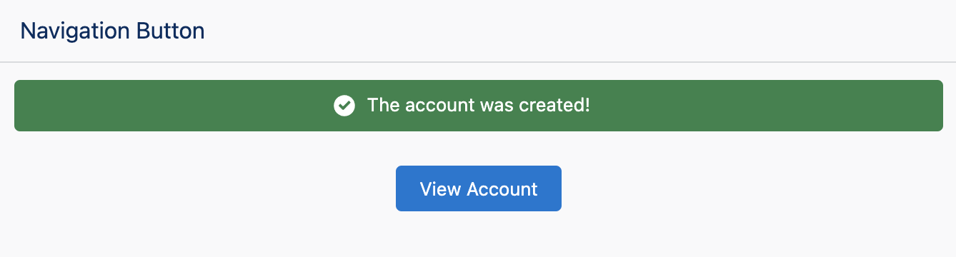
Label
The text to be displayed inside the button.
| Type |
|---|
| Text |
Variant
Changes the appearance of the button.
| Type | Valid Values |
|---|---|
| Text | base, neutral, brand (default), brand-outline, destructive, destructive-text, inverse, and success |
Icon Name
The Lightning Design System name of the icon. Names are written in the format 'utility:down' where 'utility' is the category, and 'down' is the specific icon to be displayed.
| Type |
|---|
| Text |
Icon Position
The position of the icon with respect to the button label.
| Type | Valid Values |
|---|---|
| Text | left (default), right |
Disabled
If set to true, the button will be disabled.
| Type |
|---|
| Boolean |