Spinner
Overview
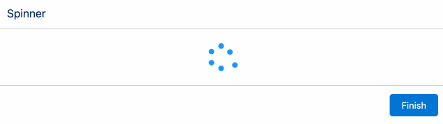
The Spinner component provides an animated visual spinner.
It is often combined with the Auto Next component to introduce a waiting or pause screen within a flow.
Configuration Inputs
Size
The size of the spinner.
| Type | Valid Values |
|---|---|
| Text | small, medium (default), large |
Variant
Controls the visual color and appearance of the spinner.
| Type | Valid Values |
|---|---|
| Text | base, brand (default), inverse |