Visual Select
Overview
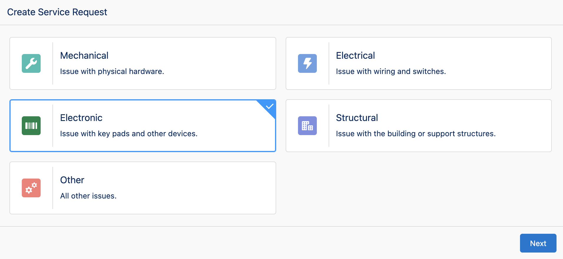
The Visual Select component displays a list of options in a grid with a custom icon and description text. This icon and description text is appended to the values of an existing picklist field on a Salesforce object. This component displays an easy-to-use selection interface that provides quick and accurate entry with the assistance of descriptions and visual icons.
We are adding new features and enhancements to this component. Please get in touch with us if this component is missing the functionality you require.
Configuration Inputs
This component uses a custom editor that provides a visual preview of what the component will look like in a Flow and interactive editing of configuration options.
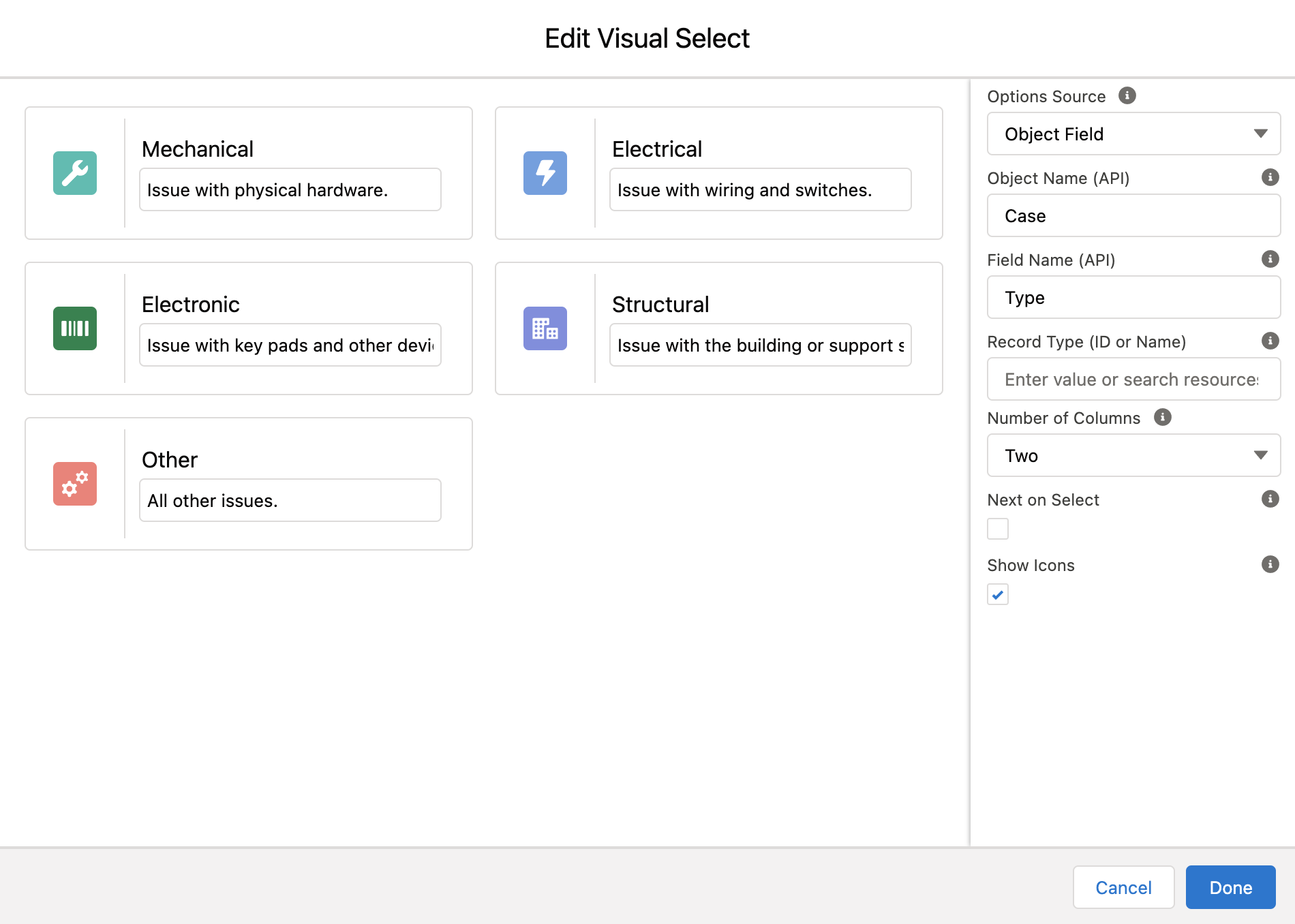
Options Source
The source for the options displayed for selection.
'Object Field' displays options based on a picklist field from an standard or custom object.
'Static List' displays hard-coded options defined by the system administrator when building the flow.
| Type | Valid Values |
|---|---|
| Text | Object Field, Static List |
Object Name (API)
The API name of a standard or custom object where the picklist field is located.
| Type |
|---|
| Text |
Field Name (API)
The API Name of a picklist field on an object that will be used to display the list of selectable options.
| Type |
|---|
| Text |
Record Type
The Record Type ID or Record Type Name restricts the available options to only values enabled for the supplied Record Type. If using Name, enter the API Name of the Record Type and not the Label.
If the Field Name (API) input is set to RecordTypeId this input will be hidden and the select option values will be Record Types from the Object Name (API) input.
| Type |
|---|
| Text |
Number of Columns
The max number of columns rendered in the visual select grid. This component is responsive, and on smaller screens, the number of columns rendered may be less than the number defined by this setting
| Type |
|---|
| Number |
Next on Select
Controls if the flow automatically advances to the next element as soon as an item is selected from the list.
| Type |
|---|
| Boolean |
Show Icons
Controls if icons are displayed.
| Type |
|---|
| Boolean |
Selected Value
Sets the selected option when the components loads. If referencing a flow variable the text entered in this field must be in the following format: {!VariableName}
This input also controls the behavior of the Visual Select component when navigating forwards and backwards within a flow. If not used, and a user navigates backwards in a flow the selected value will not be saved and the user will have to re-select an option. If this input is configured with a Flow variable the selected option will be saved when a user navigates backwards in a Flow.
| Type |
|---|
| Text |
Required
If set to true, a value must be selected before the user can proceeding in the Flow.
| Type | Default Value |
|---|---|
| Boolean | false |
Icons
Option icons are edited directly in the layout preview. To edit an icon, click the icon. This puts the option into Icon Edit Mode:
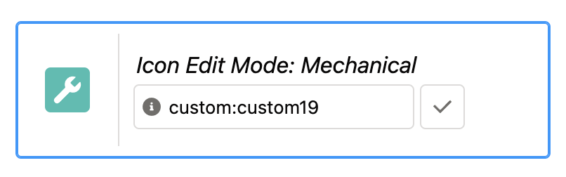
In the displayed text box enter a valid SLDS Icon. Icon names are written in the format utility:down where 'utility' is the SLDS icon category, and 'down' is the specific icon to be displayed. Examples: action:approval, utility:chart, doctype:image, standard:account, custom:custom33
Select the checkbox icon next to the text input field to enter the icon value and exit Icon Edit Mode.
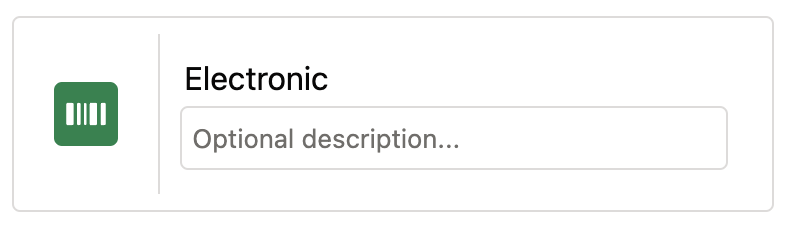
Descriptions
Option descriptions are edited directly in the layout preview. To edit a description, enter a value in the text box under the option value.
Configuration Outputs
Selected Value
The value selected.
| Type | Variable Name |
|---|---|
| Text | value |