Page Message
Overview
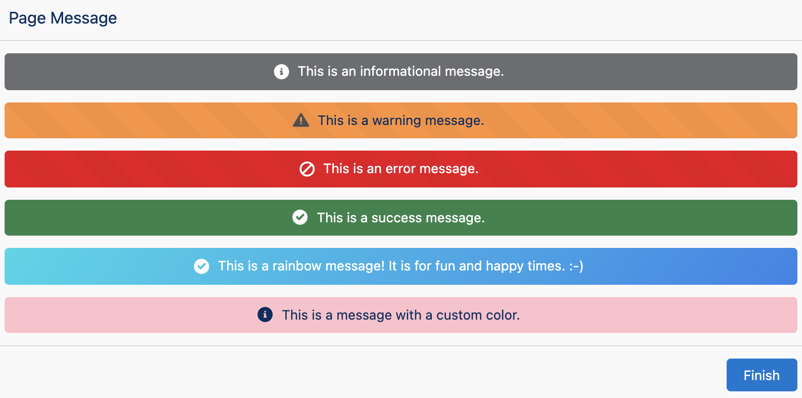
The Page Message component provides a themed message banner to the user. This is often use to display the result of an action or bring attention to an important message.
Configuration Inputs
Type
The type of page message to display. This will set default colors and icons.
| Type | Valid Values |
|---|---|
| Text | info, success, warning, error |
Message
The message that is displayed.
| Type |
|---|
| Text |
Color
Color of the page message. The value must be a valid CSS color such as green or #0176d3, brand, or rainbow. If set to brand, the primary color defined in the Lightning Theme will be used. Brand color only works in a deployed Flow and is not applied in Setup or Debugging of a Flow. The rainbow value creates a color transitioning background.
| Type |
|---|
| Text |
Icon
The Lightning Design System Icon name. Names are written in the format 'utility:down' where 'utility' is the category, and 'down' is the specific icon to be displayed. Examples: 'action:approval', 'utility:chart', 'doctype:image', 'standard:account', 'custom:custom33'
| Type |
|---|
| Text |
Hide Icon
If set to true, the icon will not be displayed.
| Type | Default |
|---|---|
| Boolean | false |