Toast
Overview
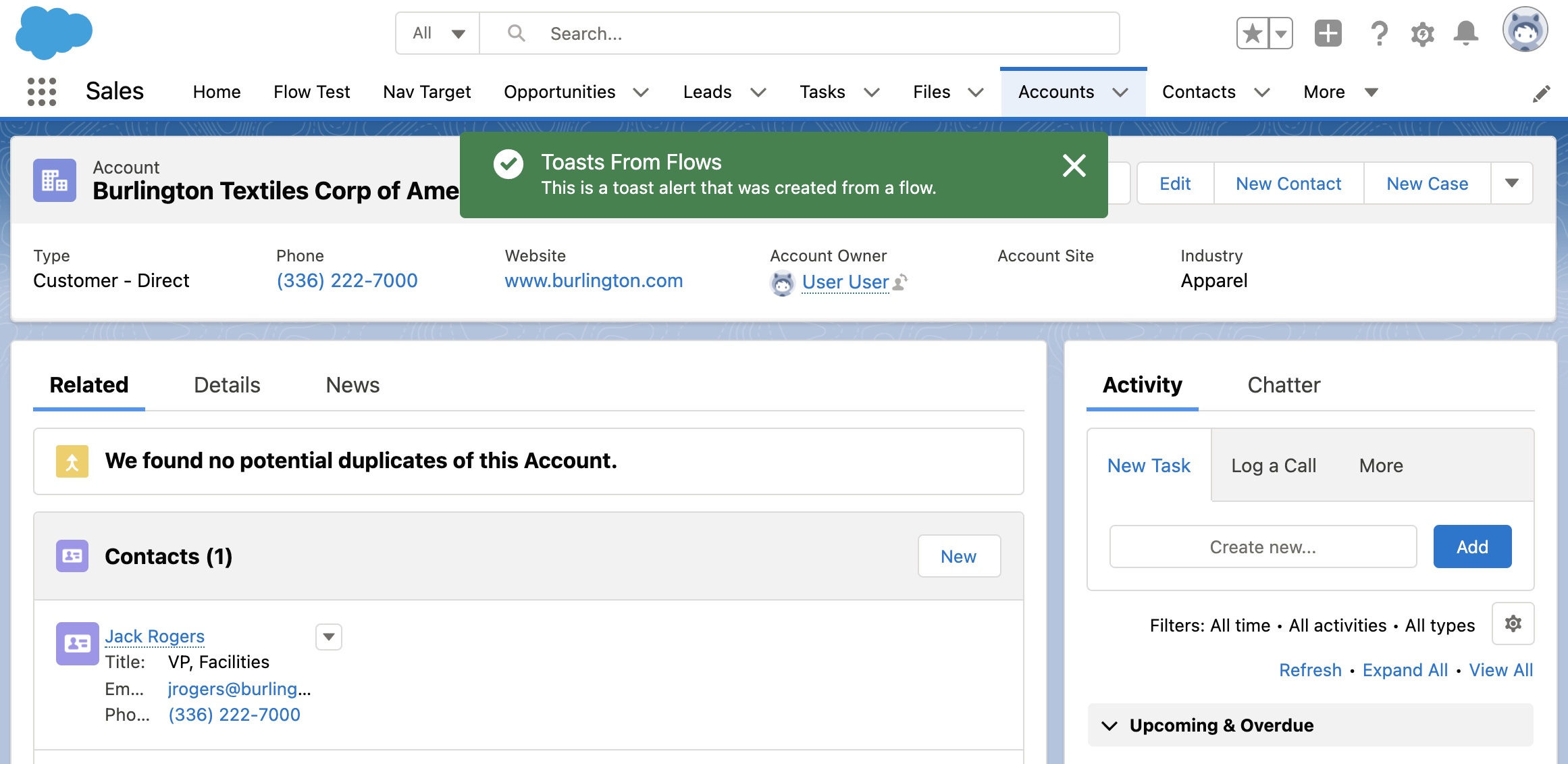
The Toast component provides a themed alert message banner to the user. This can be used to display the result of an action or bring attention to an important message. The message persists between page navigation.
This component is designed to be the only component on a Flow Screen. It displays the toast message and then automatically advances to the next step in the flow. It can be used with the Navigation component on the same Screen. Using both of these components on the same Screen is useful to show a toast message and navigate the user to a different page.
Configuration Inputs
Type
The type of page message to display. This will set default colors and icons.
| Type | Valid Values |
|---|---|
| Text | info, success, warning, error |
Message
The message displayed in the toast alert.
| Type |
|---|
| Text |
Message
The title displayed in the toast alert.
| Type |
|---|
| Text |
Mode
Controls how to dismiss the toast alert. 'dismissible': remains visible until the user clicks the close button or 3 seconds has elapsed. 'pester': remains visible for 3 seconds and cannot be dismissed. 'sticky': remains visible until the user clicks the close button.
| Type | Valid Values |
|---|---|
| Text | dismissible (default), pester, sticky |